PROBLEM
Need for a Digital Presence
Iloafyou is a newly launched micro-bakery that mainly promotes through social media, which limits its growth. To support the bakery’s expansion and build a more professional online presence, a dedicated, user-friendly website was needed.
SOLUTION
Creating a User-Friendly Website
To support iloafyou’s growth beyond social media, I designed and developed an inviting, user-friendly website that highlights the brand’s charm, streamlines the ordering experience, and builds a stronger digital presence.
EMPATHIZE
Background Research & Insights
To better understand iloafyou's customers and competitors, I began by conducting competitive analysis and user interviews, which provided valuable insights that informed the design direction.
Research Goals:
- Identify iloafyou’s target audience.
- Understand what attracts potential customers to the business.
- Analyze the strengths and weaknesses of iLoafYou’s competitors.
- Determine the key needs and expectations of the target audience, both online and offline.
Competitive Analysis
I analyzed several competing bakeries to evaluate their strengths and weaknesses. This competitive analysis provided crucial insights that will help identify opportunities to enhance user experience and reveal weaknesses that we aim to avoid.

User Interviews
I spoke with potential customers about their experiences with visiting different bakeries and ordering online. I asked open-ended questions to learn more about their needs so I can meet them successfully.
I interviewed five people remotely, each for about 15 minutes. Some of the questions I asked included:
- What motivates you to try a new local food business?
- What factors influence your decision on which bakery to order from?
- How do you feel when you shop for bakery products online (e.g., excited, uncertain, confident)?
Empathy Map
After finishing these interviews, I created an empathy map to gather all of the experiences and insights I gained from each individual.

Insights

Clear Visuals and Content
Users need clear photos and ingredient details to confidently choose what to order.

Seamless User Experience
Users expect a seamless, intuitive experience navigating and ordering through the website.
DEFINE
User Persona
Based on competitive analysis and user interviews, I created a user persona to represent iloafyou’s ideal customer. This persona highlights key needs, goals, and frustrations to guide a more user-centered and effective design. Meet Amy.

Project Goals
After getting to know our target user, Amy, I narrowed down the main problems to solve—making it easier for her to explore the menu, understand what sets iloafyou apart, and view product details online. I turned these insights into clear project goals, which guided the direction of the design.

IDEATE
Developing a Solution
After identifying our goals, it was time to develop our solutions that would enhance Amy’s user experience.
- Detailed Menu + Email Sign-Up
A clear menu with photos, ingredients, and prices helps users browse easily. An email sign-up keeps users updated on new items that match their tastes. - Showcasing Product Highlights
Featuring fresh ingredients, artisan techniques, and customer reviews highlights what makes iloafyou stand out. - Product Catalog + Instagram Gallery
A visual catalog with clear descriptions and an Instagram-powered gallery gives users a direct view of the bakery’s products.
Site Map
To ensure a logical and easy-to-navigate structure for the website, I created a site map that focuses on the prioritized solutions.

User Flow
Next, I aimed to gain a deeper understanding of Amy's journey by creating user flows that mapped out her interactions with the website. These flows accounted for the different decisions she might make and the various choices she would encounter in certain scenarios.
.png)
Low-Fidelity Wireframes
Now it was time to begin wireframing and bringing these ideas to life. The low-fidelity designs provided an early look at how the website could function, showcasing how key features and project goals would be achieved.

PROTYPING & TESTING
Mid-Fidelity Wireframes
After completing the low-fidelity wireframes, I moved on to mid-fidelity designs to create a clickable prototype for user testing. I digitized them on Sketch and optimized the layout for multiple screen sizes to ensure a smooth experience across devices.

Usability Testing
After creating my prototype, I brought back the same participants for usability testing to observe how they interacted with the design and identify areas for improvement.
I gave users specific tasks—like finding a menu item, subscribing for updates, or browsing the product gallery—and watched in real time over Zoom as they completed them. I took notes on where users hesitated, spent too much time, or skipped over content, and noted their pain points throughout the experience.
Affinity Map
I synthesized these findings into an affinity map using FigJam, incorporating user quotes, observations, and insights from their experiences to better understand how they interacted with the prototype.

Iterations
After observing how users interacted with the prototype, I iterated on the design to better align with their needs and preferences.
Clickable Elements
User testing showed that visitors mistook underlined headings like 'Our Menu' for decoration and skipped them. I updated all pages with clear buttons and visual cues to make the links more noticeable and clickable.

Design System
I crafted a cohesive design system for the website using elegant fonts and a modern blue color palette that aligns with the brand's identity. I created custom icons to complement the overall aesthetic. I prioritized accessibility by ensuring high contrast for visibility and optimized interactive elements for easy navigation on all devices, with well-spaced buttons and clear functionality.

High Fidelity Wireframes

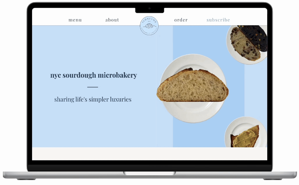
SOLUTION
Website For Launch
After finalizing the designs and optimizing the site, the website was ready for launch. Built to showcase the brand identity and attract more customers, the website saw positive results. Within two months of its launch, customer engagement increased by 50%, and the site received over 2,000 visits, helping to double the customer base.
CONCLUSION
Key Takeaways
What I Learned
Creating my first website for iloafyou was a hands-on learning experience that taught me how to bring a brand to life online. I learned how to build a cohesive and accessible design system from scratch, balancing style with functionality. User feedback helped me understand how subtle design decisions—like visual hierarchy and link styling—can influence how people navigate a site. I also gained confidence in designing for accessibility by using high contrast, clear typography, and layouts that adapt across screen sizes.
Next Steps
Moving forward, I plan to conduct more usability testing with a broader range of users, especially on mobile. I’d also like to explore new features like online ordering, a newsletter sign-up, and seasonal promotions to help iloafyou grow its customer base and engagement.
Other Projects