Micro
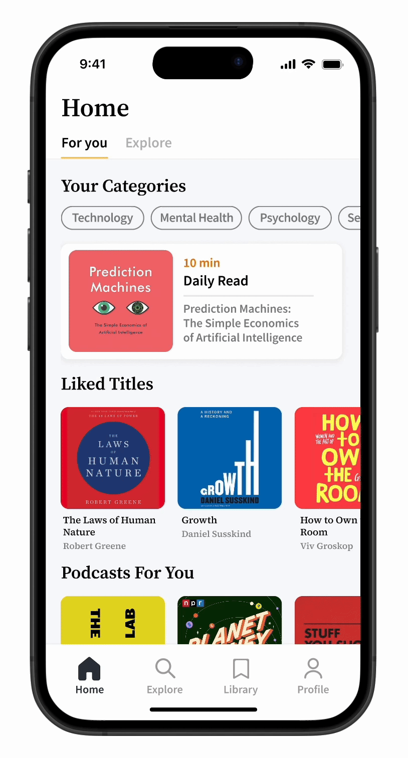
Micro is a mobile app designed to help users learn new topics efficiently through bite-sized lessons, featuring curated books and podcasts. By researching, designing, and prototyping, I created an intuitive platform that personalizes content based on user preferences, making continuous learning more accessible and engaging.
PROBLEM
People spend less time learning and more time scrolling
People spend hours scrolling on their phones but struggle to make time for meaningful learning. With constant distractions, it’s harder to stay engaged with knowledge in a world where traditional learning feels overwhelming.
SOLUTION
Learn more with Micro
Micro is an app that makes learning easy, even with a busy lifestyle. Through short, engaging lessons from books and podcasts, it helps users turn idle screen time into an opportunity for growth and knowledge.
Personalized Content
Micro analyzes user preferences to create a personalized learning experience, making the content more relevant and engaging.
Bite-Sized Lessons
Turning key ideas from books and podcasts into short, easy-to-understand lessons—each with text, audio, and visuals.
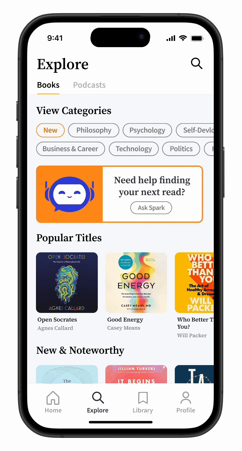
AI Recommendations
Micro uses AI through a chatbot named Spark to assist users, providing personalized lesson recommendations and enhancing the learning experience.
Design Process

EMPATHIZE
Understanding the Users
Before diving into design, I conducted desk research to understand digital consumption trends and their impact on learning.
Key Insights:
- The average person spends 4 hours and 37 minutes on their phone every day (Statista 2024).
- Over 50% of Gen Z and Millennials report feeling guilty about how much time they waste on their phones (Deloitte, 2023).
- Attention spans have decreased by nearly 25% in the past two decades, making long-form content harder to engage with (Microsoft, 2022).
Empathy Map
To expand on my research, I conducted user surveys and interviews to explore the challenges people face with learning and their phone usage habits. I then synthesized these findings into an empathy map to identify key behaviors, thoughts, and frustrations.

User Pain Points
After completing 15 user interviews and empathy mapping, I gathered that:
67%
Found traditional learning too time-consuming
80%
Wanted to replace endless scrolling with learning
73%
Spent over 4 hours daily on their phones
DEFINE
User Persona
Now that I’ve gathered data, I created a user persona named Jillian—a young marketing professional who wants to keep learning but struggles to find the time. This persona has helped shape my design decisions and continues to guide how Micro delivers quick, personalized, and engaging content.

IDEATE
User Flow
To better understand how users interact with Micro, I created a user flow showing how Jillian navigates the app to fit learning into her busy schedule. It revealed key tasks, decision points, and pain points, guiding thoughtful design choices to enhance usability and engagement.

Low-Fidelity Wireframes
Using insights from research, I created low-fidelity wireframe sketches to figure out how Micro could help users achieve their learning goals. These early designs helped visualize the app’s structure and how the app would function.

PROTYPING & TESTING
Major Improvements + Iterations
Next, I created a prototype for users to test. Using the feedback gathered, I made key revisions to improve the experience and better align with user needs.
Preferences
I added a progress bar and numerical step indicator ("1/5") to the preferences test, helping users track their place and feel more guided throughout the flow.

Title Screen
To improve the Title Screen I added a download button so users can access lessons offline, swipeable tabs for seamless navigation between reviews and similar content, and a key takeaways section to give users a quick summary of the lesson’s most important points.

Design System
As I developed the app, I created a consistent design system to keep the experience clean and cohesive. I chose readable font pairings and selected colors that support both visual appeal and usability. Accessibility was also a priority, with choices like high contrast and touch-friendly elements to ensure the app is usable for everyone.

High Fidelity Wireframes