.png)
MSU Library Kiosks
Michigan State University’s main library supports a campus of over 57,000 people, but outdated and confusing kiosks made it hard for users to find books, access information, or navigate the space. To boost engagement and improve the overall experience, I led the redesign with a team of four, creating a more intuitive, helpful, and inviting kiosk system that better supports MSU’s students, staff, and visitors.
PROBLEM
Students struggle to find information and ignore the kiosks
The current library kiosks are not intuitive or efficient and are often ignored by MSU students, staff, and visitors. As a result, they fail to serve their intended purpose of providing quick access to information and resources.
SOLUTION
An intuitive and welcoming redesign
To encourage more students and staff to engage with the kiosks, a redesign featuring interactive, user-friendly signs is essential. The updated kiosks will guide users with interactive maps, routes, and key information like library hours and events.
Design Process

EMPATHIZE
Understanding the Problem
To understand why the kiosks were being underused, our team met with the MSU Libraries’ user experience team. Visual designer Shelby Kroske shared that students often skipped the kiosks entirely and rarely engaged with them upon entering the library. This insight highlighted the need to gather direct feedback from students and faculty about their experiences navigating the library and accessing information.
User Interviews & Surveys
We conducted 15 semi-structured interviews and surveys with a diverse group, including 10 undergraduate students, 2 graduate students, and 3 faculty members. Our goal was to understand how MSU students feel about the library kiosks and what features matter most to them.

Key Takeaways
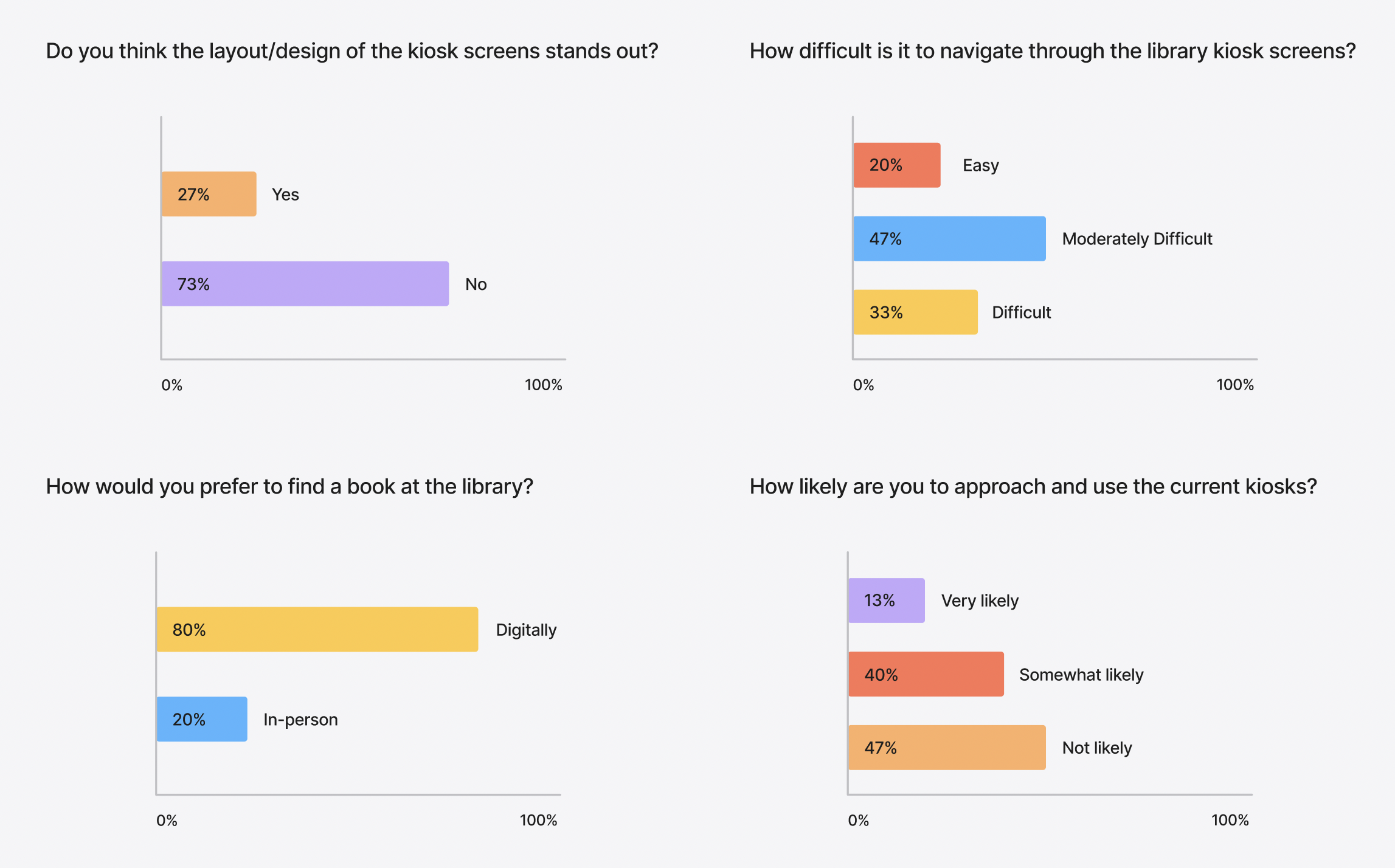
1. Low Engagement with Kiosks
A majority of users rarely or never use the kiosks, suggesting they may not understand their purpose or often overlook them. This points to a need for better visibility and clearer signage.
2. Reluctance to Use the Kiosks
Over 47% of users are unlikely to approach the kiosks, indicating usability and trust gap that could be improved through better UI and placement.
3. Navigation is a Pain Point
Nearly half of users found the kiosk moderately difficult to use, and 33% found it outright difficult. This highlights a need for simplification and better information hierarchy in the UI.
DEFINE
User Persona
To better visualize how the MSU community will interact with the kiosks, we created a user persona based on the interviews and surveys we conducted. By synthesizing the data, our goal was to gain a deeper understanding of students' and staff's preferences, pain points, and behaviors to guide an effective redesign.

IDEATE
User Flow
To better understand how users interact with Micro, I created a user flow showing how Jillian navigates the app to fit learning into her busy schedule. It revealed key tasks, decision points, and pain points, guiding thoughtful design choices to enhance usability and engagement.

PROTYPING & TESTING
Major Improvements + Redesign
Next, I created a prototype for users to test. Using the feedback gathered, I made key revisions to improve the experience and better align with user needs.

Original Home Page Issues
1. Outdated visuals and content
• Images and information feel old or irrelevant, which can reduce user trust and engagement.
• Users may question the reliability of the kiosk if the content appears neglected or stale.
2. Inconsistent and Small Text
• Text sizes vary and are often too small, making it difficult for users to read and quickly process information.
3. Unwelcoming Interface
• The design lacks a friendly greeting or inviting visuals, making the kiosk feel cold and unapproachable.

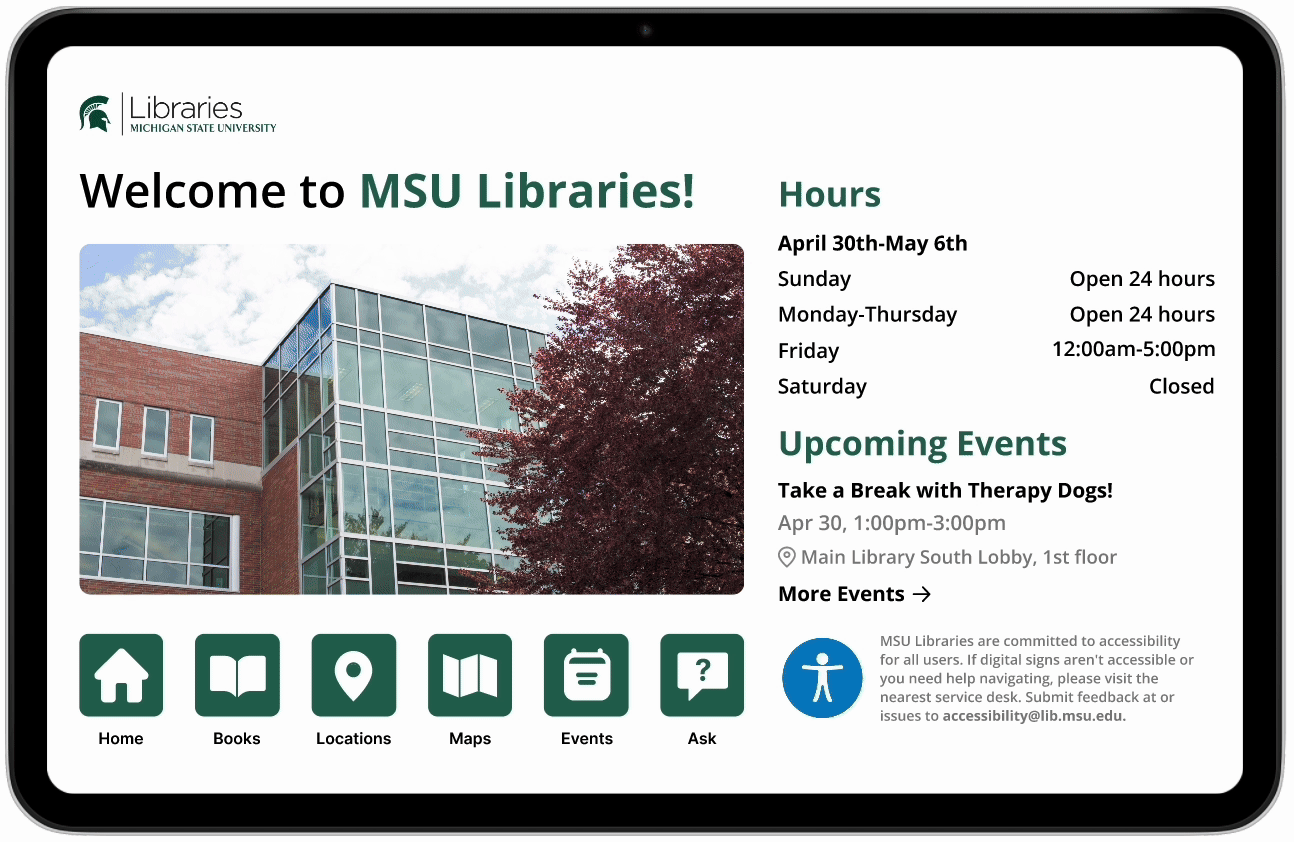
Home Page Redesign
1. Updated Visuals and Accurate Content
• Relevant images and current information help keep users engaged with the content.
2. Consistent and Readable Text
• Improved typography makes content easier to scan and helps users find information more quickly.
3. Welcoming and Guided Interface
• Adding a welcoming greeting encourages user interaction and makes the kiosk feel more approachable.
• Updated icons create a clearer, more modern look to the kiosks.

Original Find a Location Page
1. Outdated Maps and Information
• The campus map displayed outdated building information.
• Map key lacked clarity, making it difficult for users to interpret locations.
2. Poor location visbility
• Not all destinations were clearly marked or labeled, making it hard for users to find specific areas at a glance.
3. Confusing wayfinding
• The directional indicator was not distinct and lacked a visible path, making it hard for users to follow or notice.

Find a Location Redesign
1. Updated Maps and Information
• Refreshed the campus map with accurate, high-resolution graphics and an updated map key.
2. Poor location visbility
• Improved layout and labeling so key locations are easier to spot and navigate.
3. Confusing wayfinding
• Made directional arrows more visible, showing users their location and pointing them to their destination.

Original Ask a Librarian Page
1. Overwhelming Text Layout
• Dense blocks of text with little spacing make the content hard to scan and digest.
2. Unattractive List Design
• The subject specialties list lacks visual hierarchy and feels monotonous to navigate.

Ask a Librarian Redesign
1. Cleaner Text Layout
• Added spacing and structure to improve readability and make the information easier to scan.
2. Refreshed Visual Design for Subject List
• Enhanced the list of subject specialties with a scroll bar and clearer hierarchy, making it easier to navigate.
• Introduced icons for accessibility and search, enabling users to easily find a department without having to scroll.
High Fidelity Wireframes